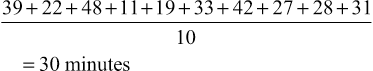
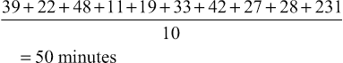
Miriam Fine-Goulden, Victor Grech • Know about the different ways in which data can be categorized and displayed • Understand frequency distributions and features of a normal distribution • Know how to describe different types of data • Know what confidence intervals and p-values are and how they can be used • Understand about the application of appropriate statistical tests • Understand how to interpret statistical results in clinical and epidemiological studies Statistics are ‘a body of methods for making wise decisions in the face of uncertainty’ (W Wallis: A New Approach, 1957). As doctors, it is essential for us to have an understanding of statistical principles and methods so that we can: Other sections in this book describe research, evidence-based medicine and epidemiology. This chapter will cover the fundamentals of statistics that will provide the tools to navigate the world of clinical and epidemiological research and appreciate its scope and limitations. While all tests are carried out using software packages, readers of journals and researchers need to know which test to implement and understand what the programme is doing and what sort of output to expect. Statistical methods can be applied to quantitative data, a set of numbers and values that have been measured. The type and/or method of recording of quantitative data is important since it influences the choice of statistical tests as well as the way in which the data is described and displayed. Qualitative data, by comparison, is descriptive and usually represents an expression of thoughts, feelings or experiences. There are resources available which detail appropriate methodologies for analysing qualitative data, but this will not be covered in this chapter. Quantitative data (also referred to as variables, i.e. a characteristic, number or quantity that differs between individuals or items) can be numeric, in which a number is recorded, or categorical (Fig. 38.1). Numeric data, in which a number is recorded, can be further subdivided into discrete or continuous datasets: Categorical data can be: The best method for displaying data depends on the type of data and the number of variables and datapoints. A good pictorial presentation of data can be an extremely effective and efficient means of communication. It is also crucial to plot the data: Tables are a useful way to summarize and present data and can usually provide more precise numerical data than a graph. Pie charts are used to demonstrate proportions of a group falling into different categories. A circle is divided into segments, and the angles are proportional to the size of each category (Fig. 38.2). Bar charts (Fig. 38.3) can be used to display a single variable, with the heights of the bars proportional to the frequency. They may also show the relationship between two variables by being grouped or stacked. Dot diagrams (Fig. 38.4) can be used to display continuous numeric data for a variable, for a single group or multiple groups. Each dot represents a single value. It is a simple method of conveying as much information as possible, and it is easy to see outliers and to compare the distribution of results in different groups, but it may not be practical where there are large numbers of measurements. When measurements are repeated at different time points, for example, before and after a certain treatment, lines drawn between paired dots (Fig. 38.5) can illustrate measurements or the effect of intervention/treatment. Scatterplots (Fig. 38.6) illustrate the relationship between two continuous variables, represented on vertical and horizontal axes. Scatterplots may include a line of best fit (see Correlation and regression, below). Typically, the line in the middle of the box represents the median value, the upper and lower horizontal lines of the box represent the upper and lower quartiles and each contain 25% of the values, so the box encompasses 50% of the values. The limits of the whiskers represent the highest and lowest values (i.e. the range) and each whisker encompasses 25% of the values (Fig. 38.7). The normal distribution is symmetrical and bell-shaped (Fig. 38.8). It is a familiar concept in medicine, as much of the data collected from human subjects is normally distributed, e.g. height and weight. Data that has a non-normal distribution may be skewed, to the left or to the right. A good example of skewed data in medicine is length of hospital stay: most patients stay for a short period of time, but a small number of patients stay for an extended period, pulling the ‘tail’ of the distribution to the right. Whether or not a set of data is normally distributed may be important when it comes to applying statistical tests, as some tests are only valid for normally distributed data. It may be possible to tell if data is normally distributed by ‘eyeballing’ it in graphical form. There are also mathematical tests that can be applied. These cannot confirm that the data are normally distributed, but can confirm that they are compatible with a normal distribution. In some cases, non-normally distributed data can be ‘transformed’, for example by logging or squaring, to take on a normal distribution so that certain statistical tests can be applied. The method used is determined by the nature of the data. Tests that rely on the data being normally distributed are known as parametric tests. If datasets are large but not normally distributed, parametric tests may still work well: a property known as robustness. Tests which make no assumptions about the normality of the data distribution are called non-parametric tests. These are almost as efficient as parametric tests for normally distributed data and superior for non-normally distributed data. The mean – or average – is a familiar concept. It is calculated by adding up all the values and dividing by the total number of values. For example, the mean time (in minutes) from triage to assessment by a doctor for ten children with fever ≥40°C in an emergency department is the total of all the values divided by ten: Group 1 mean: The mean is a useful measure of the centre where values are normally distributed or close to normally distributed, but it can be affected dramatically by one or two extreme values. For example, in the group above, if there was one child who waited for a long time because the doctor was unavailable, this could have a significant effect on the results: Group 2 mean: The median value is another measure of the centre, and it is the actual middle value (or the mean of the two middle values if there is an even number of values), so there will be the same number of values above and below it. The median is less influenced by skewed data than the mean. In the example above, the median value will be in between the 5th and 6th values (as there are ten values, an even number – if there were 11, it would be the 6th value). Group 1 median: Group 2 median: The single large value that influenced the mean in group 1 did not have as much of an effect on the median. In data that is normally distributed, the mean and median values will be the same; the greater the skew of the data, the greater the difference between the median and the mean. In non-normally distributed data, the median is therefore usually more representative of the centre than the mean. However, because the median is less sensitive to changes in the data, it may be a less useful summary measure. In a table summarizing data, it may be helpful to display both values. As well as giving an idea of the centre of the data, we also need to know about its spread, or variability, its dispersion. The range is the difference between the highest and lowest values. It is often given in brackets after the mean or median. For example, using our data for children with fever (above), ‘the mean time from triage to assessment was 30 minutes (11–48)’, or ‘the median time for triage to assessment was 30.5 minutes (11–231)’. One problem with the range is that it is influenced by outliers (extreme values). It can also depend on sample size, as the larger the sample size, the greater the range is likely to be. A measure of spread that is not sensitive to outliers is the interquartile range, as described above under Box-and-whisker plot. The standard deviation is a measure of the spread of data around the mean. In normally distributed data, measurements will be either larger or smaller than the mean. Subtracting the mean from each value gives the difference between that value and the mean. Because the numbers below the mean will be negative (which is not important, because it is the actual difference that matters), all the numbers are squared (to make them all positive), and then added together. If there is a wide spread about the mean, the values will all be very different from the mean, giving a large number, and conversely, if they are tightly grouped around the mean, the number will be small. The variance is the sum of all the squared differences divided by the total number in that sample minus one (so, for example, if there are 100 patient measurements in the sample, you would divide by 99 to get the variance). The square root of the variance is then obtained in order to ‘unsquare’ the value, and this is called the standard deviation (SD). Therefore:
Statistics
Introduction
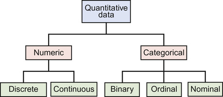
Types of data
Displaying data
Tables
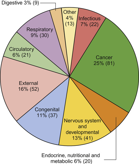
Pie charts
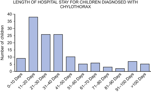
Bar charts
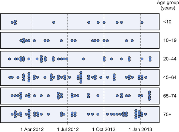
Dot diagrams
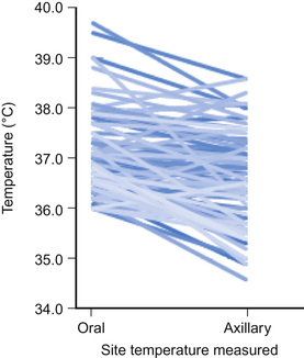
Line diagrams
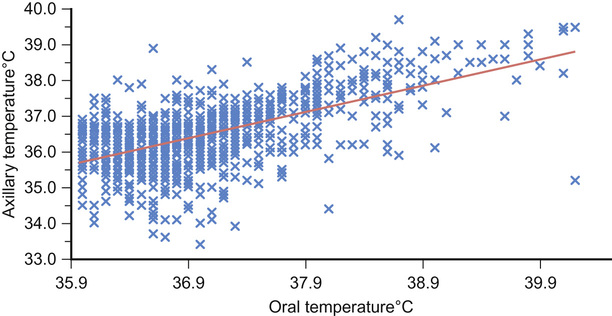
Scatterplots
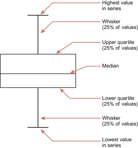
Box-and-whisker plots
Describing data
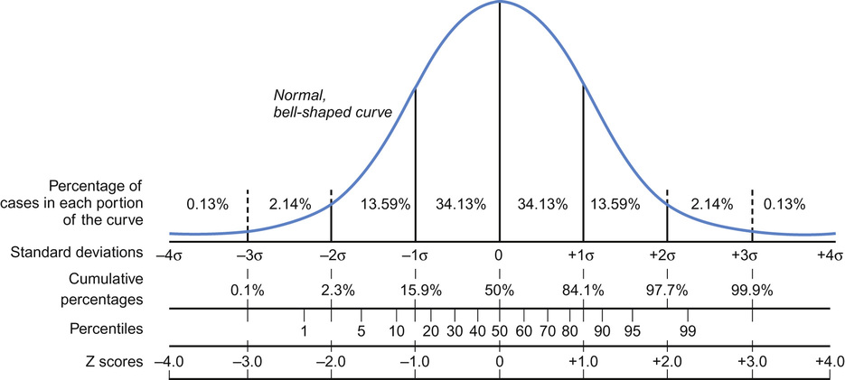
Frequency distributions
Tests of normality and data transformation
Mean and median


Data spread

Statistics
Chapter 38
Learning objectives
By the end of this chapter the reader should: